
MART
Packaging design
industry
Beverage, Wine
client
WINEHOUSE LCC
year
2024
overview
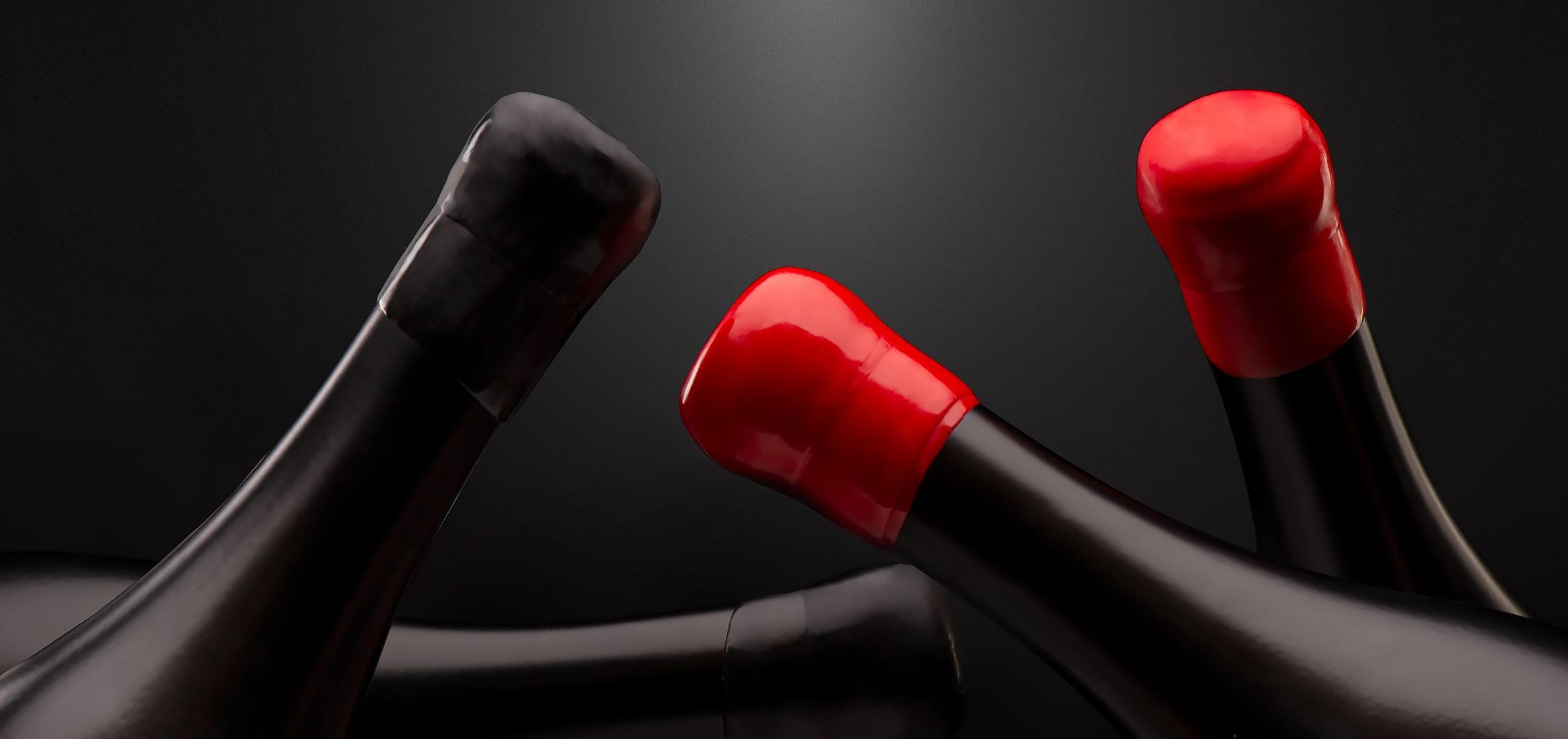
Wine “Mart”: a triumphant blend of distinct grapes, presented in packaging that manifests collaboration and a logo that symbolizes the power of unity.
challenge
We faced a captivating task to conceive packaging and a name befitting a red wine crafted from a blend of distinct grape varieties. Inspired by the dynamic interplay between these varieties, we envisioned a concept that would encapsulate their spirited clash.
solution
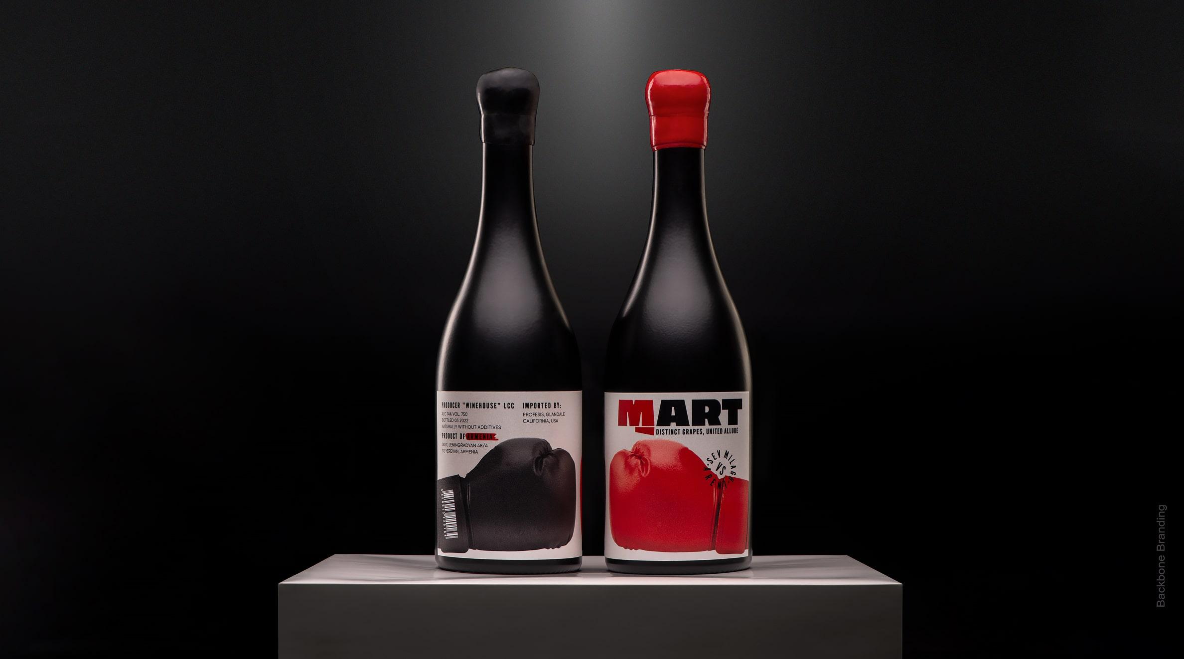
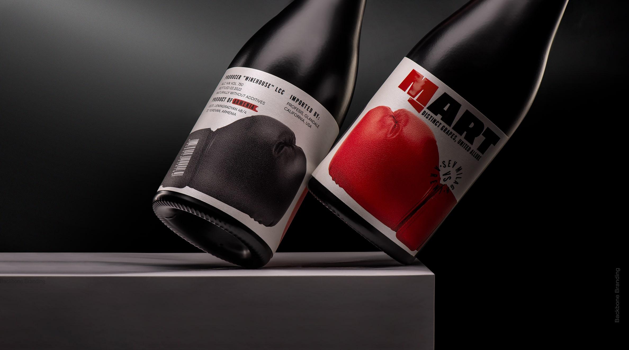
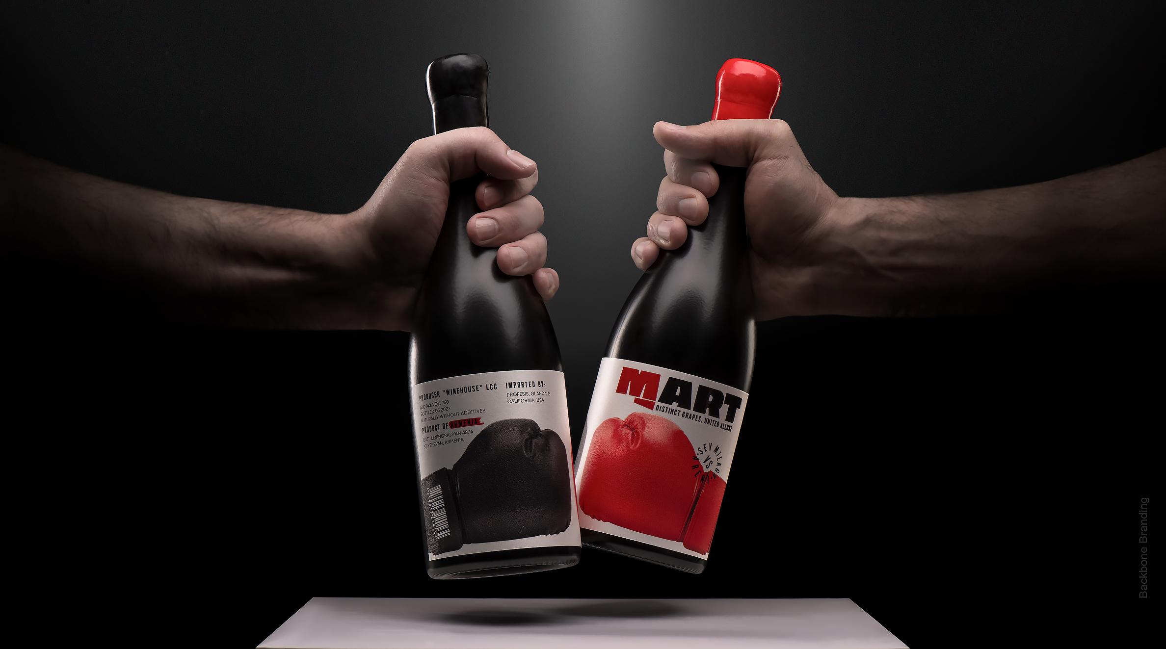
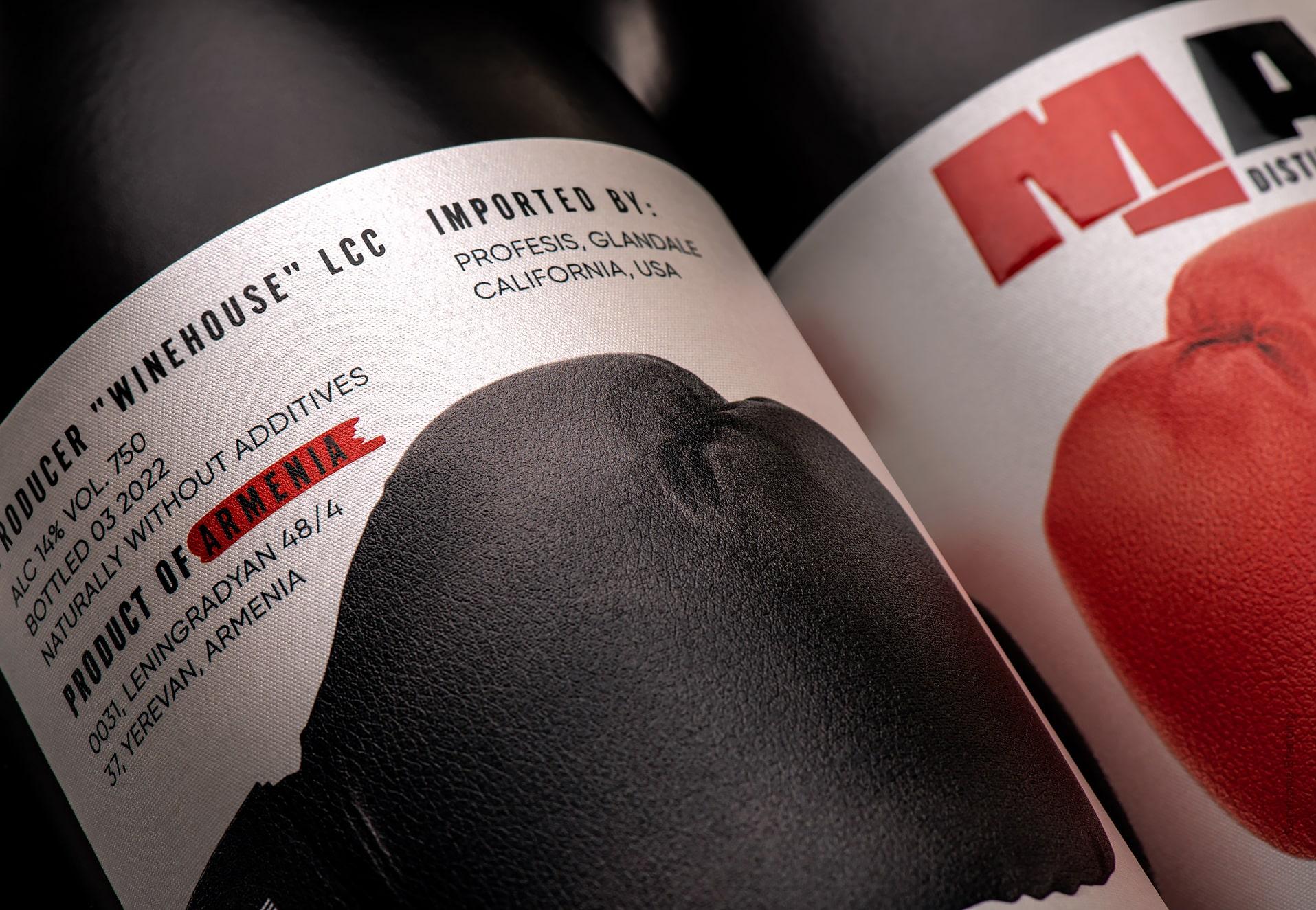
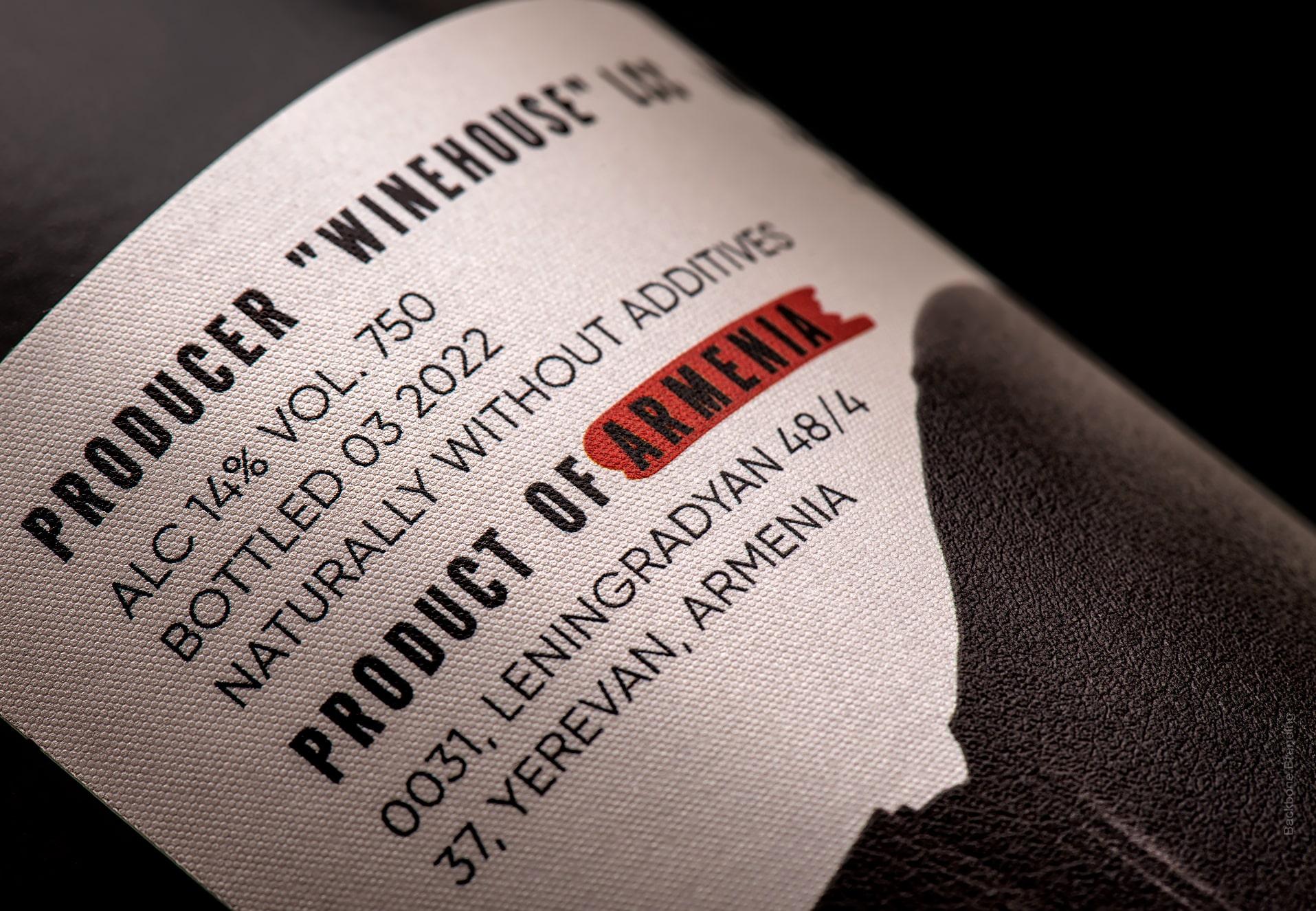
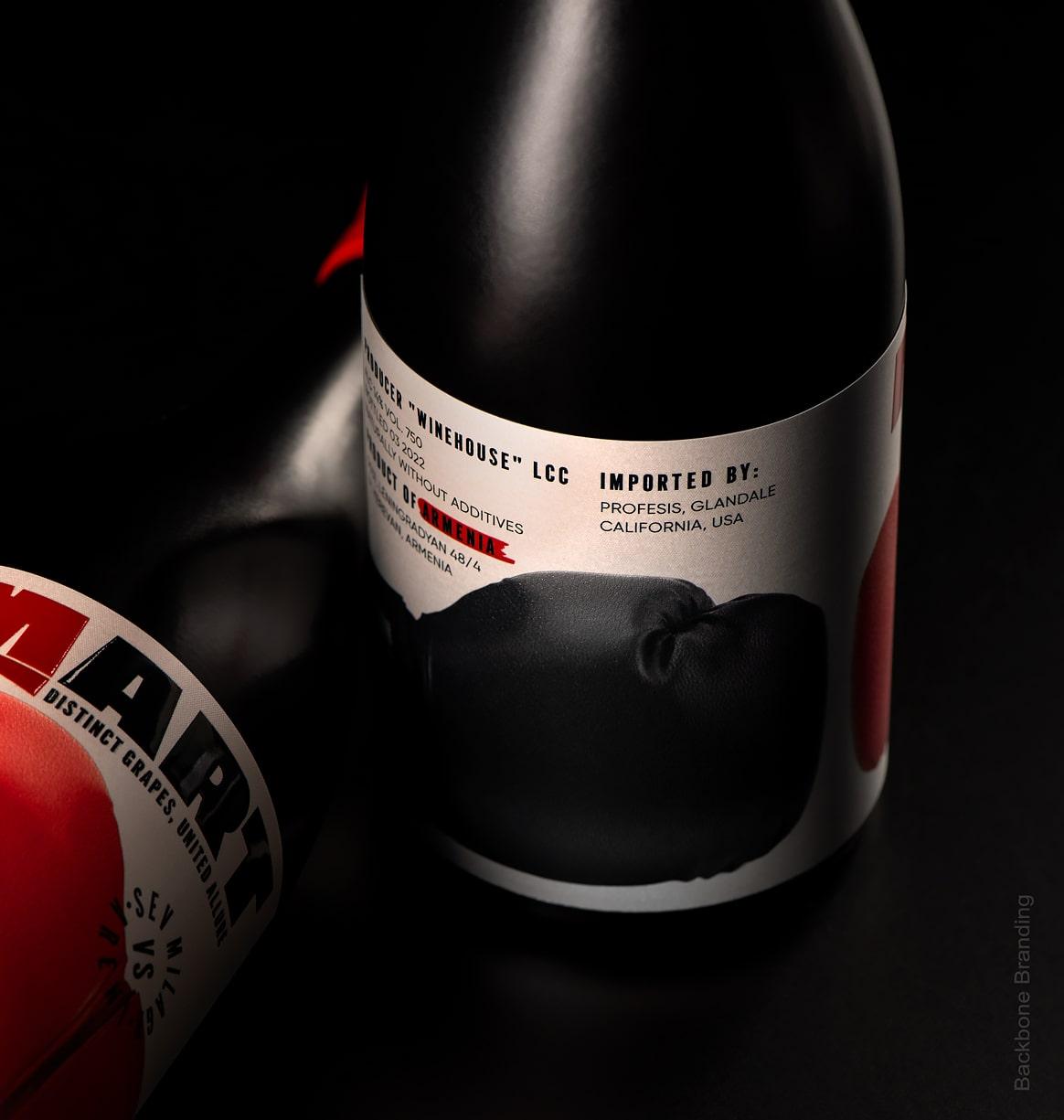
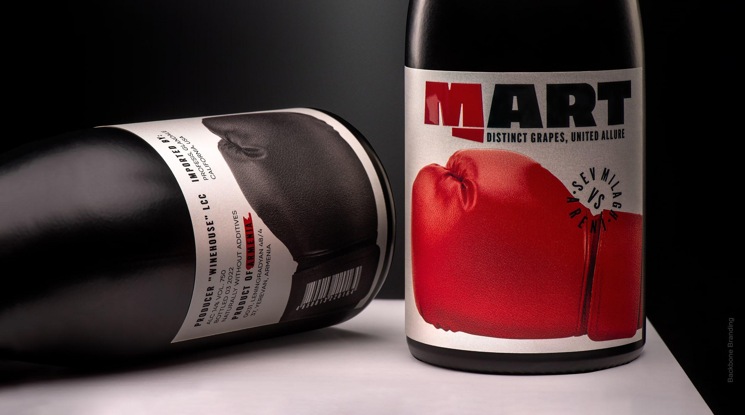
The idea of a mixture of distinct grapes led us from the name to the design. We came up with "Mart," a name derived from the word meaning "fight." The very essence of this wine embodies the confrontation and eventual collaboration between the grape types, resulting in a harmonious and exceptional flavor. To visually represent this concept, we designed the packaging that features two boxing gloves engaged in a symbolic battle. Rather than illustrating a victor or defeated, the design honors the mutual respect and cooperation between the grapes, ultimately yielding in a victorious synergy of flavors.
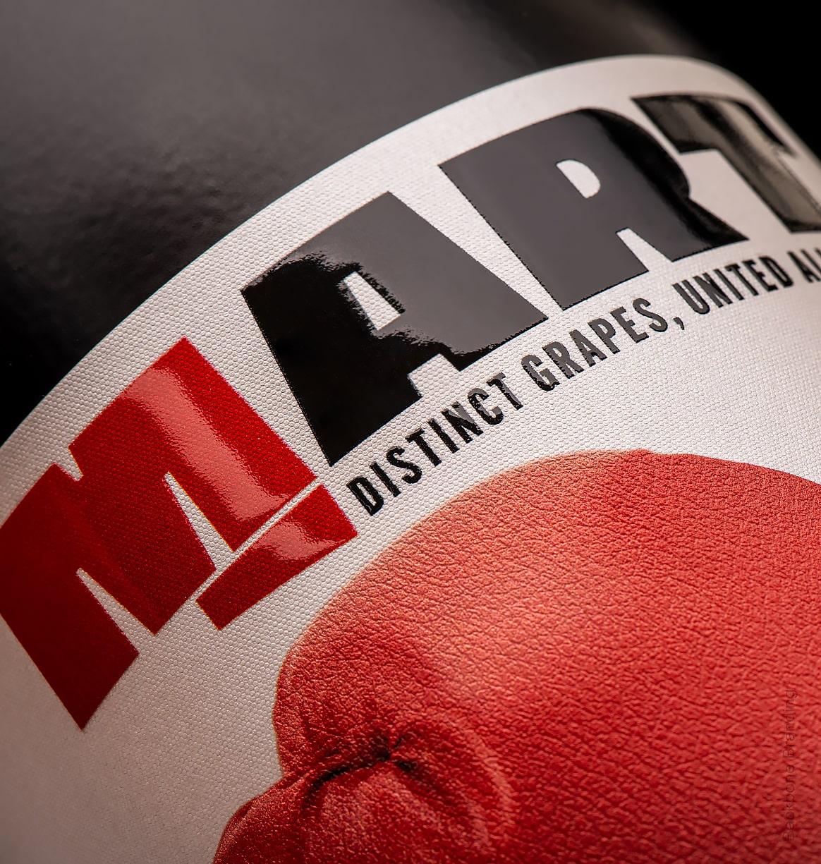
An "M" sculpted into a clenched fist, as a symbol of strength, where unity exists.
1
/
2
Packaging that tells a story of struggle, where battles give way to the harmony of collaboration.
More works