Squeeze & Fresh
Branding Services
industry
Juice
client
Squeeze & Fresh
year
2016
awards

overview
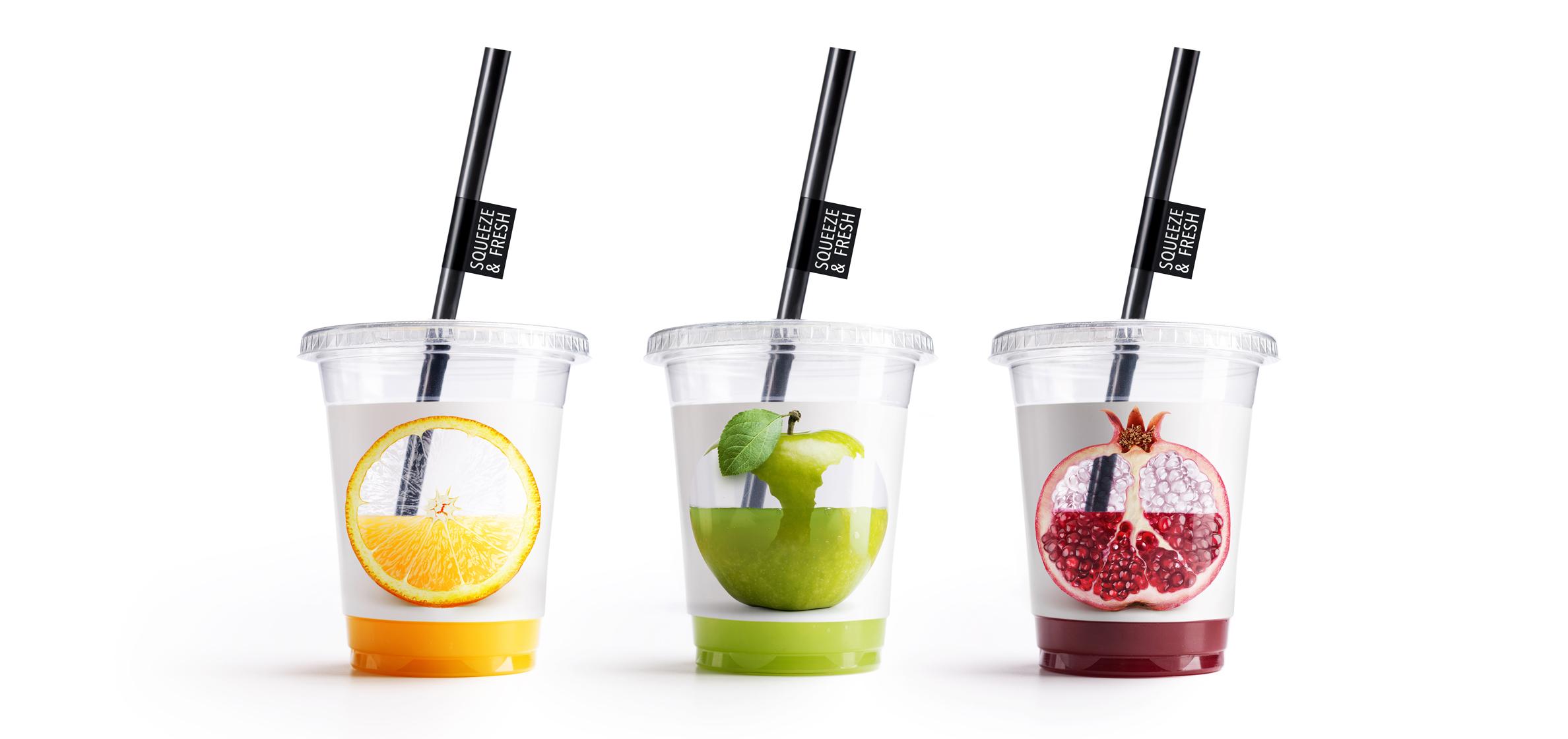
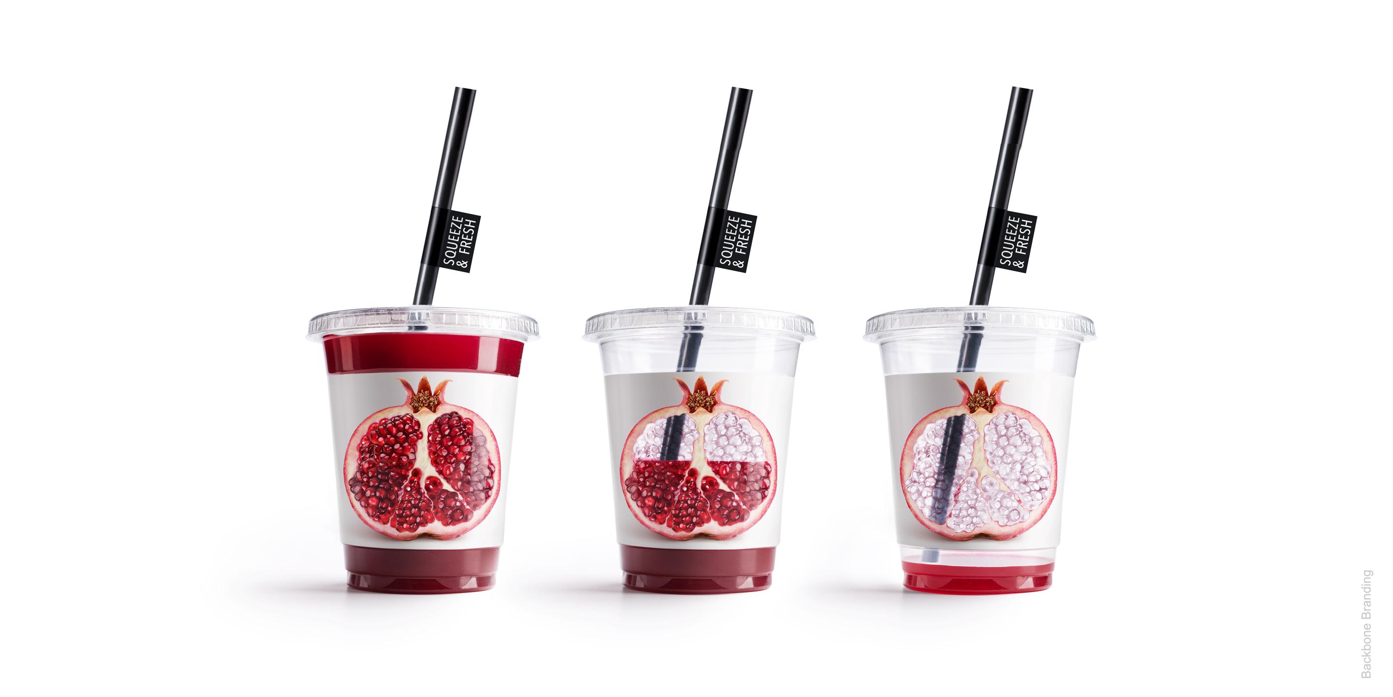
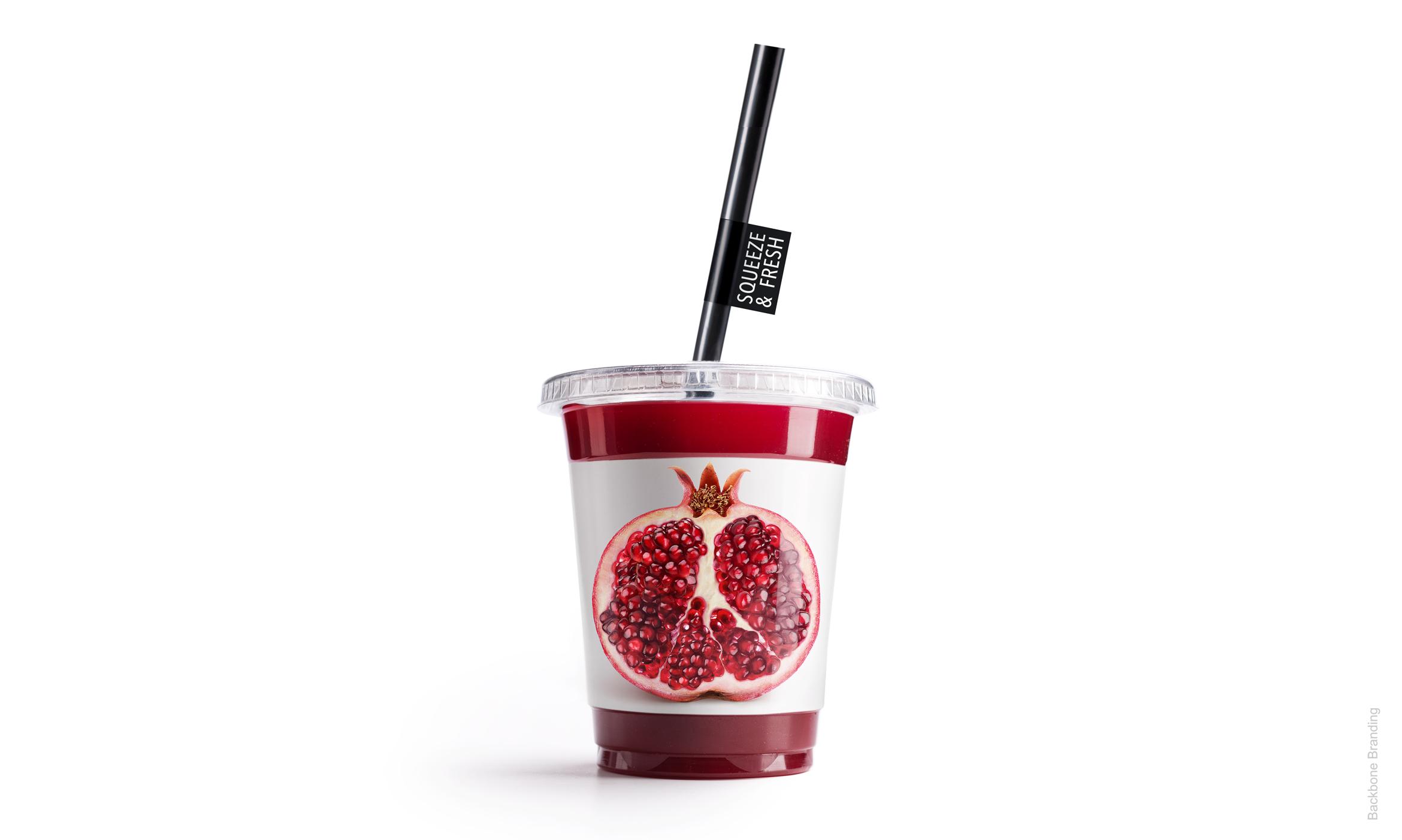
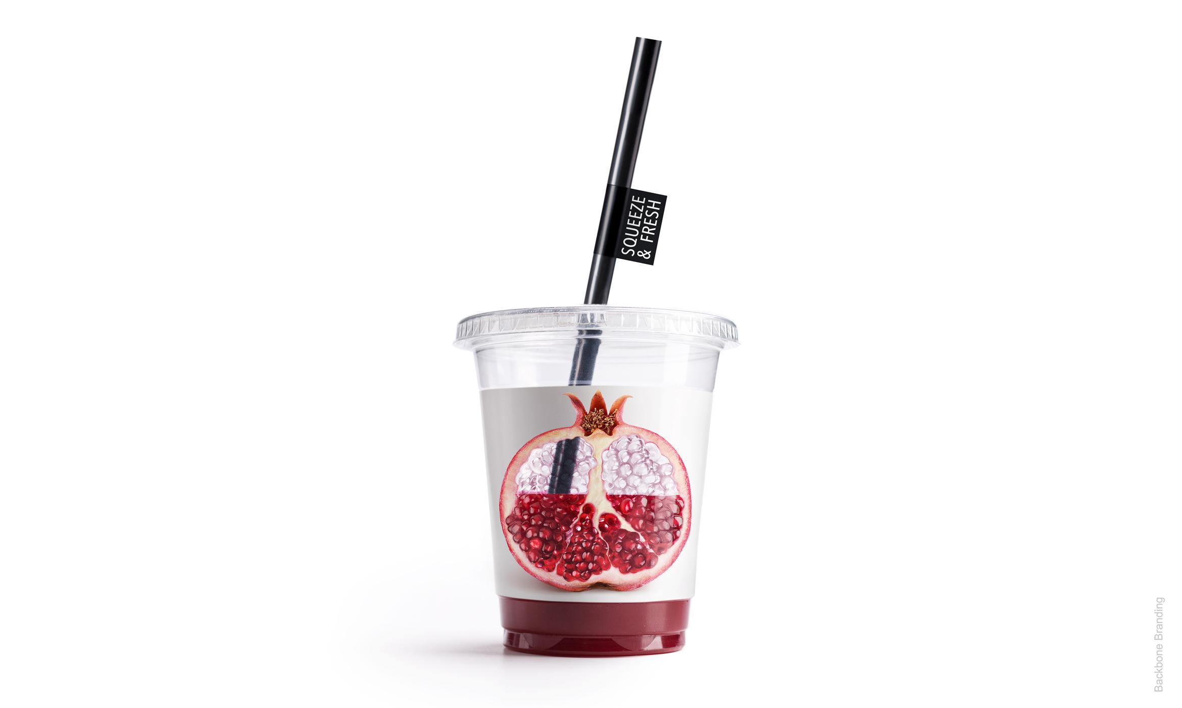
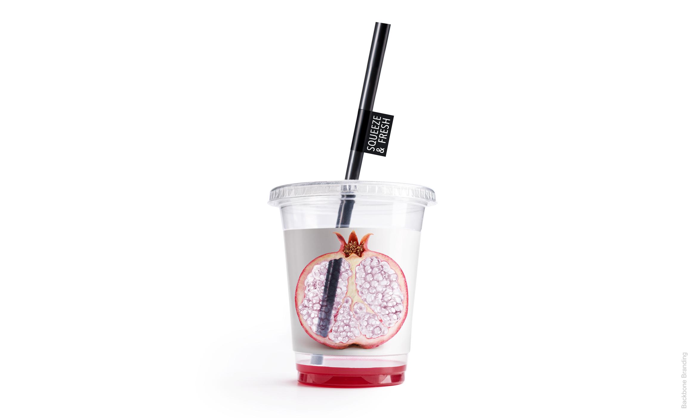
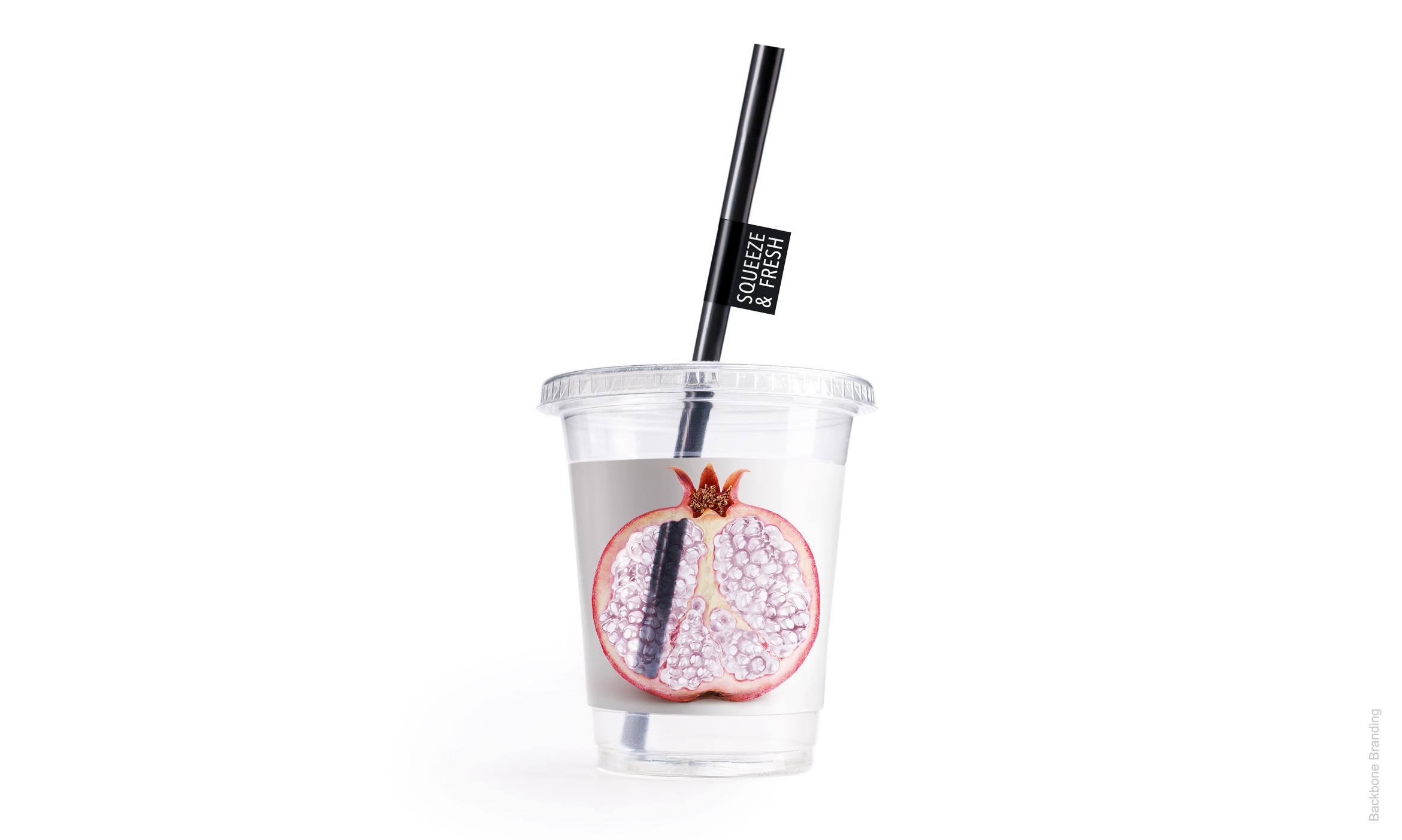
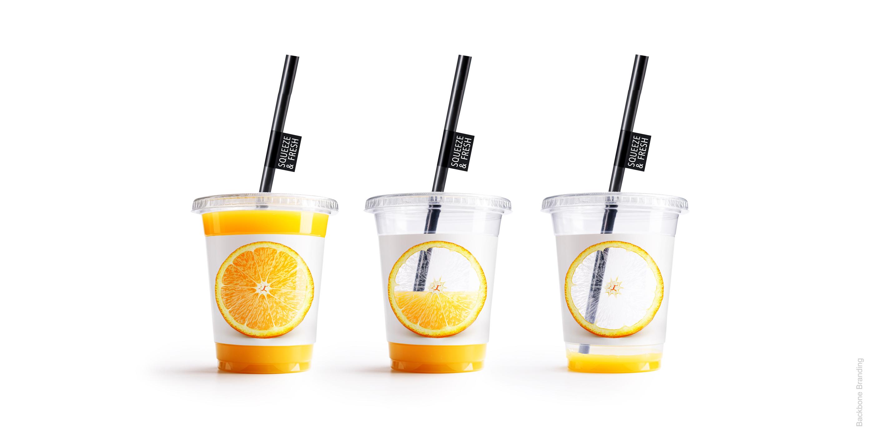
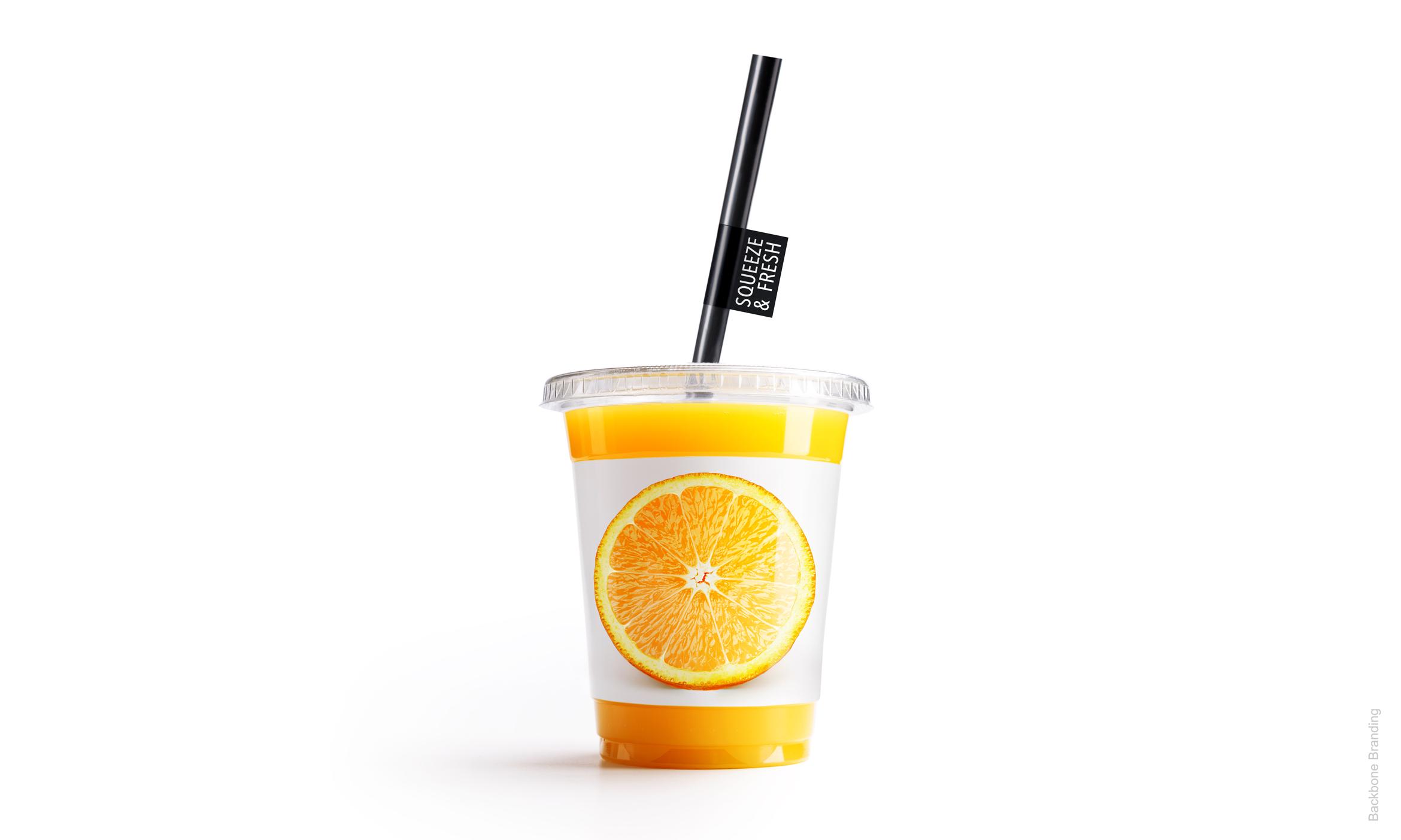
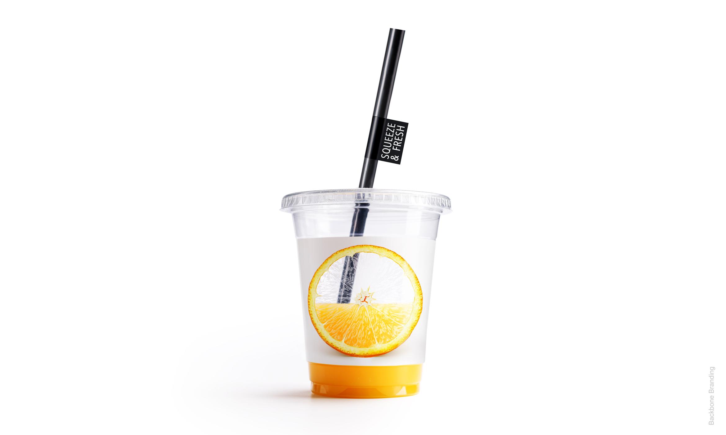
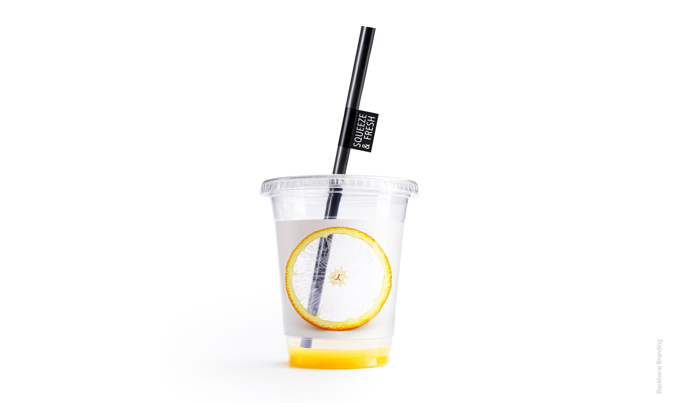
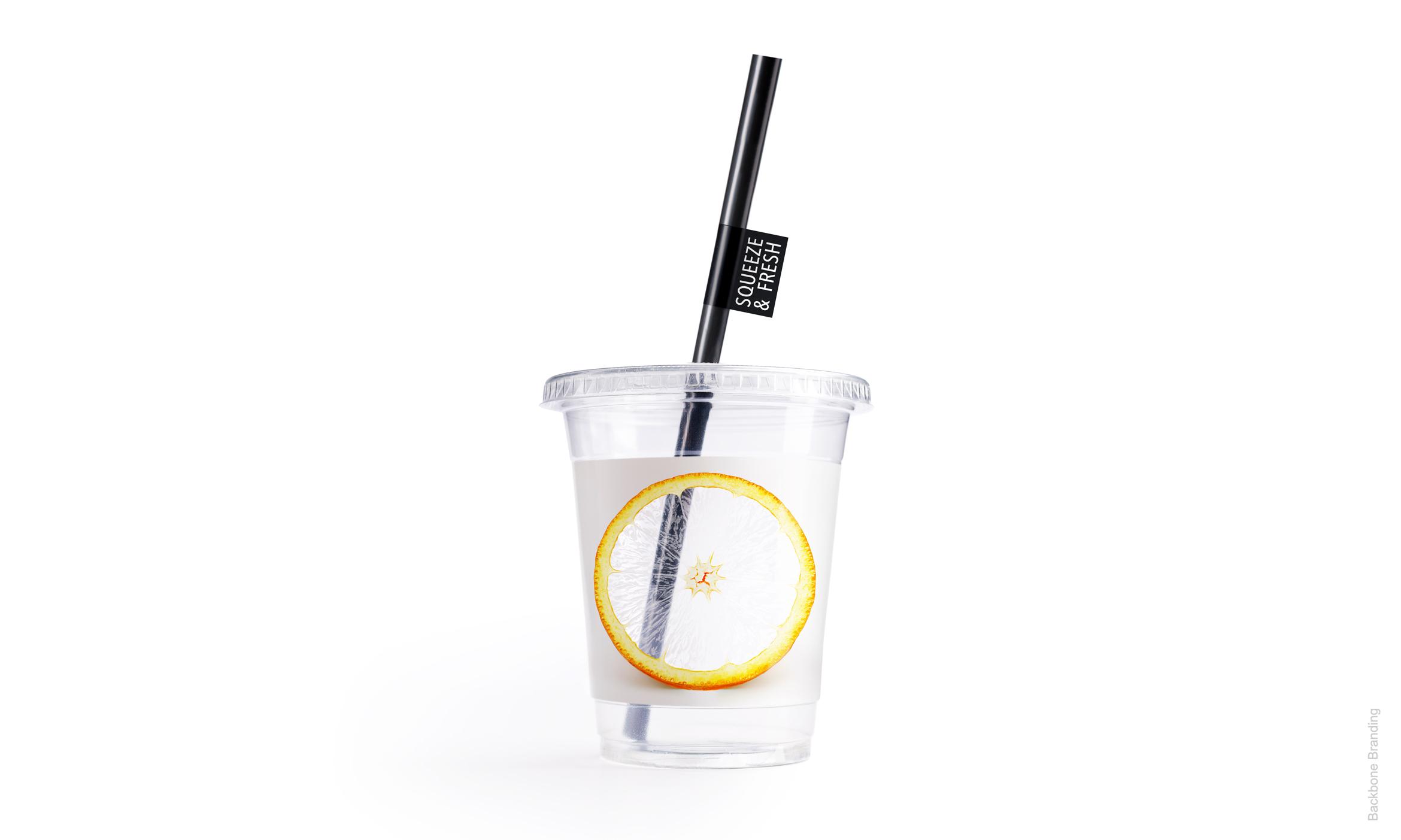
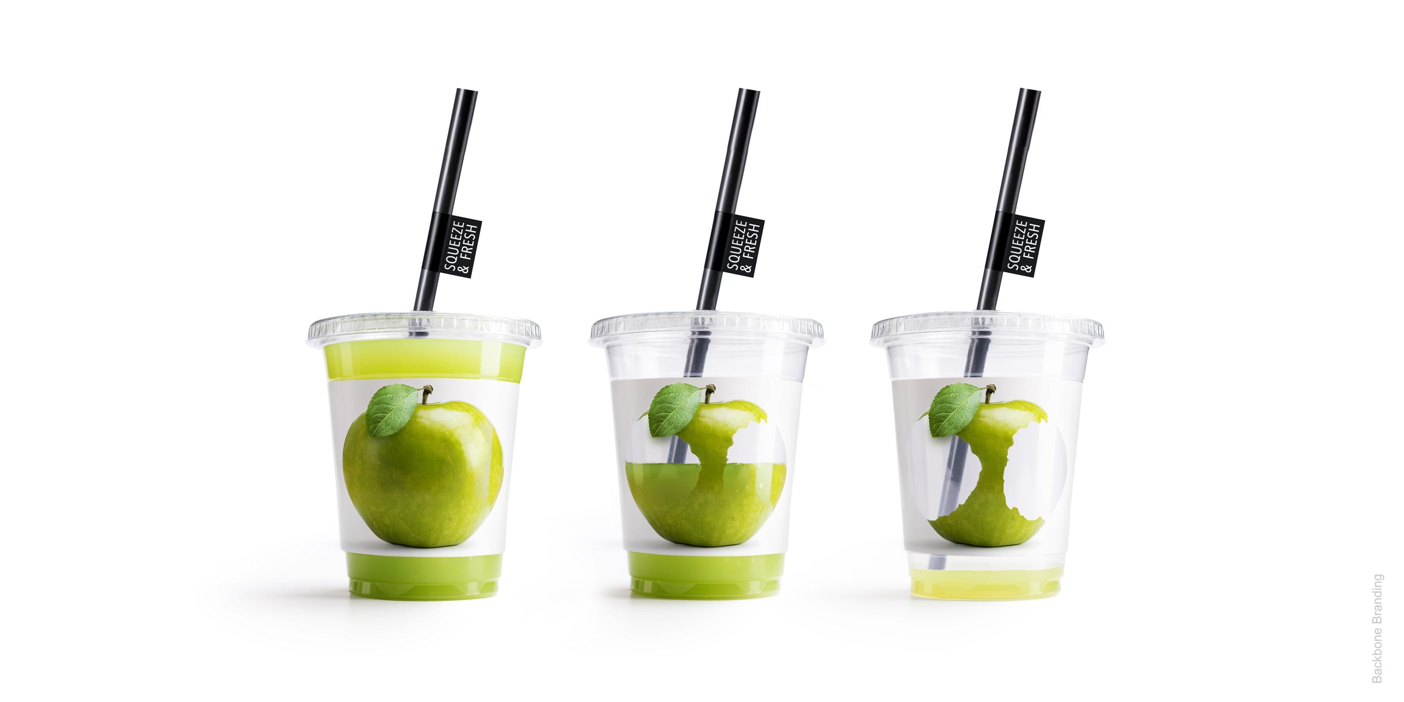
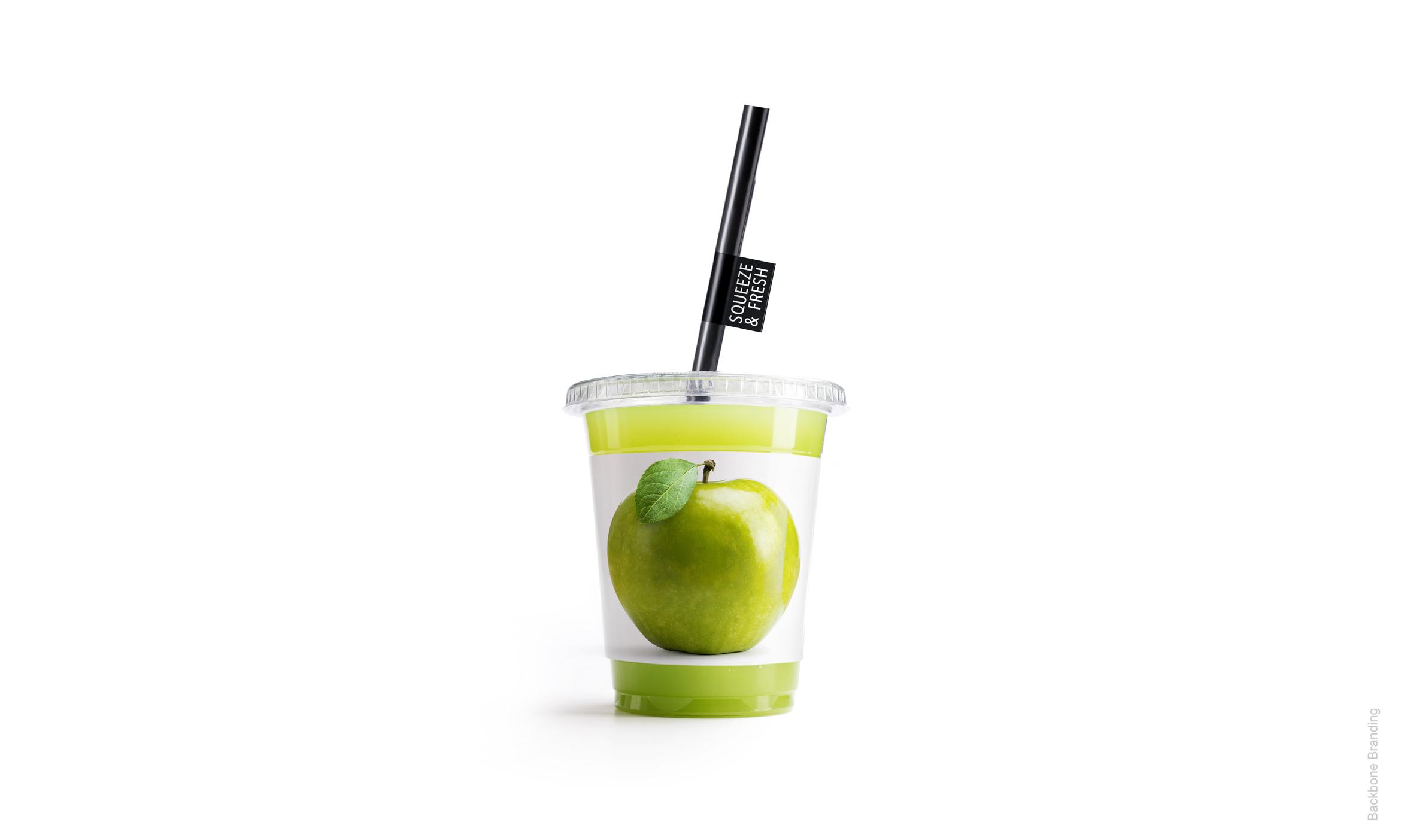
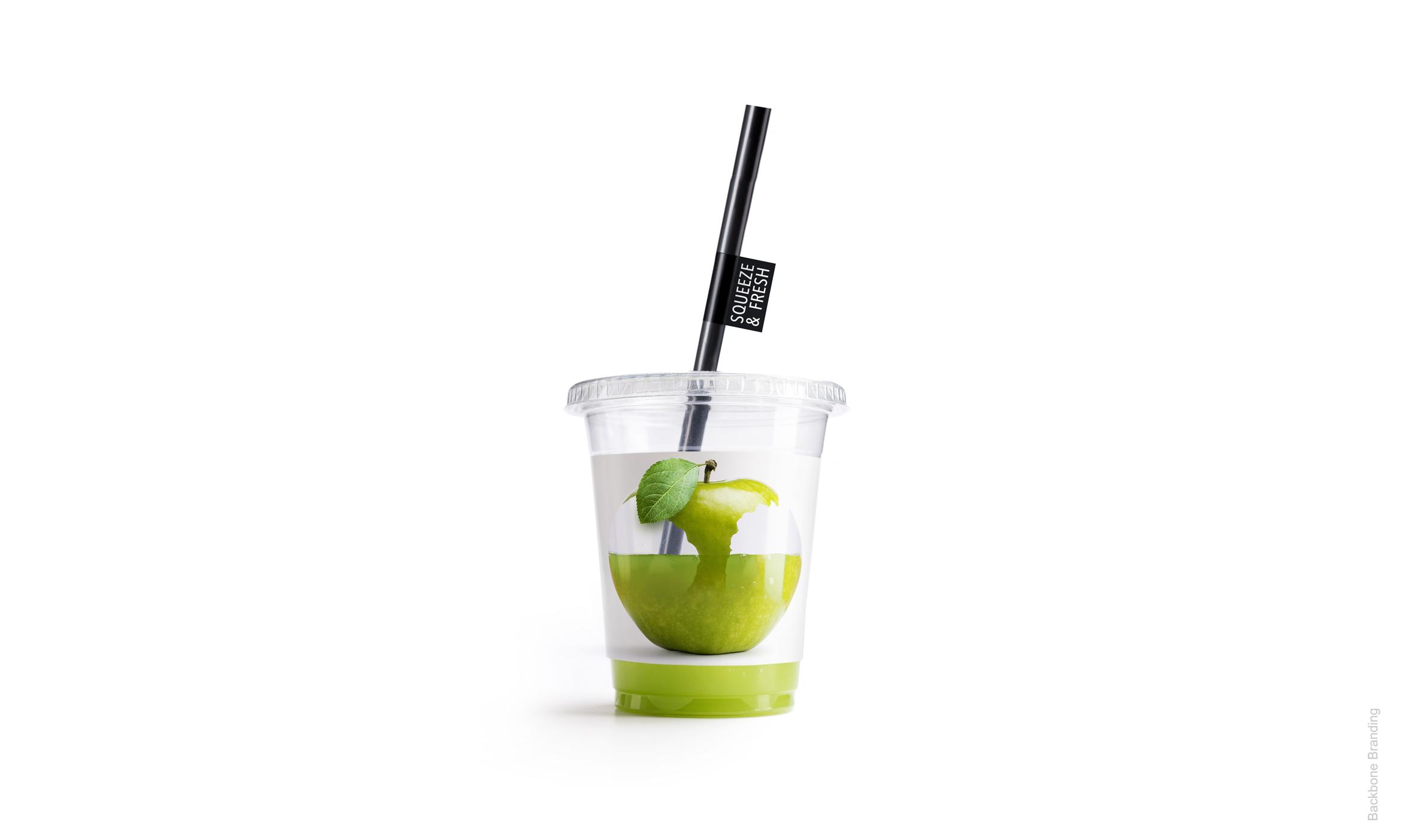
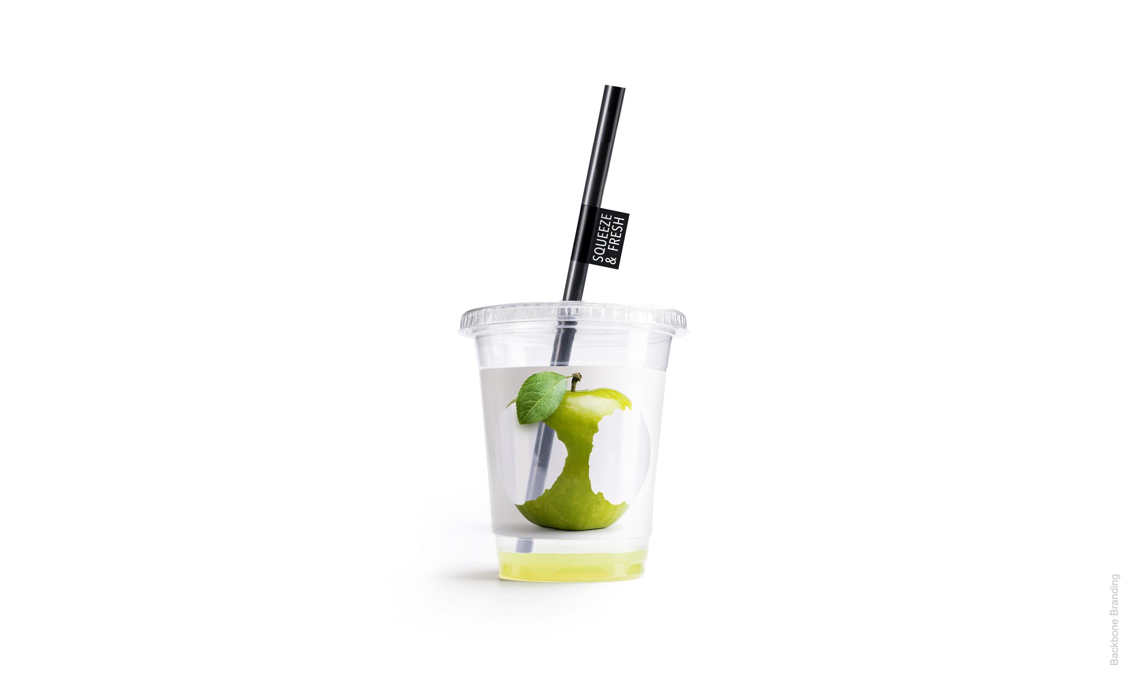
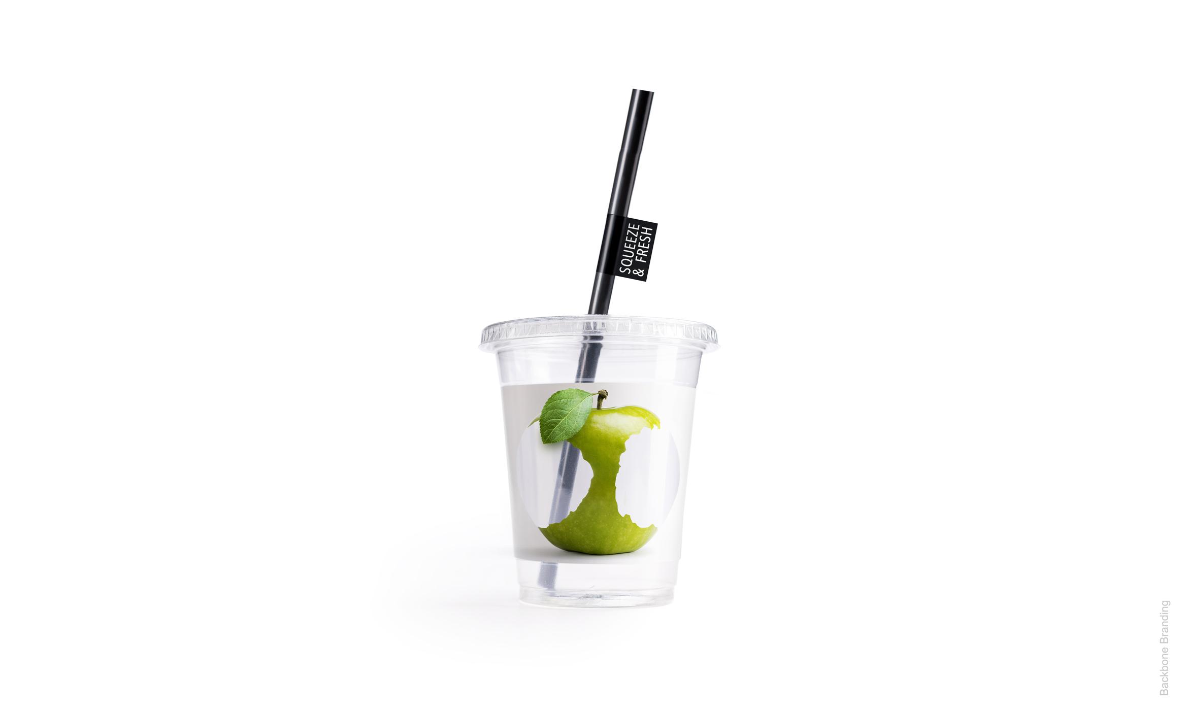
The cup undergoes a visual transformation when filled with juice, making the fruit appear complete and vibrant. When the cup is empty, only the squeezed fruit picture remains visible.
challenge
The challenge was to create a packaging design that visually represented the process of squeezing fresh fruit while providing an immersive and memorable experience for consumers. The design needed to capture the essence of freshness and communicate the product's name, "Squeeze & Fresh," effectively.
solution
Our design team implemented a transparent cup with a fruit illustration that appears incomplete or partially filled with color when empty. As the cup is filled with fruit juice, the color of the juice blends with the illustration, completing the image and making it look like whole fruit. The choice of transparent materials ensured the fruit juice appears fresh and enticing to consumers.
The cup's design allowed for easy identification of different flavors or variations within the product range. This innovative packaging design creates a dynamic visual effect, emphasizing the process of extracting juice from the fruit. It reinforces the concept of "Squeeze & Fresh" and enhances the overall packaging experience. The design not only catches the attention of consumers but also communicates the product's freshness, authenticity, and uniqueness effectively.
Click for more
1
/
4
1
/
4
1
/
4
More works